Good Vibes Only is owned by me, Jessica, and I work as a freelance front-end developer. I write about things I’ve experimented with and thoughts I like to share, focusing on creativity and CSS.
I have a love for CSS because it’s what makes the web look interesting and fun!
Things I have written
Newest longer vibes
Coming Home Curious
There are a few things I really try to prioritize as a freelance developer, and one of them is continuously collecting new knowledge and inspiration. It's how I keep evolving in my craft. A week ago I got to do exactly that at CSS Day in Amsterdam.
I imagine I’m not the only one who thinks about time and wishes I had more of it. I know I don’t have less time than anyone else, but sometimes it really feels like I do or at least less than I would like. Maybe it’s an art to manage it well or maybe I simply have too many wishes.
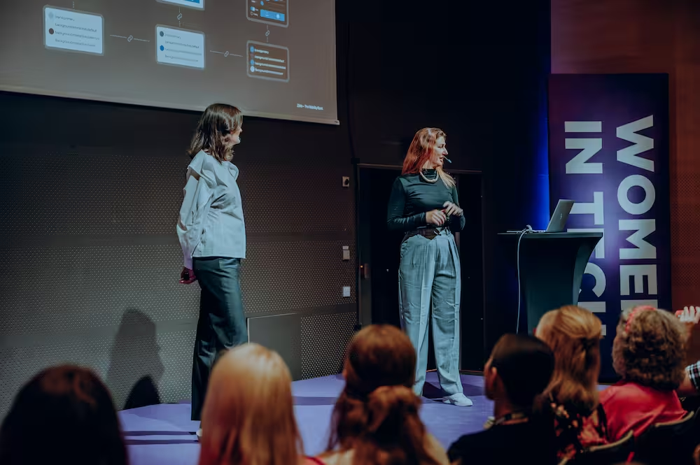
Today I’m feeling proud ✨ of the work my team and I have done with the design system in my current assignment at Ziklo Bank. Last week, my colleague Elin and I spoke at the Women in Tech Conference, where we shared our journey.
We’ve gotten so many new CSS selectors lately that almost feel like magic, but with magic comes confusion. Sometimes it’s surprisingly hard to see the difference between two selectors that look almost identical. Do you know the difference between :has(:not(…)) and :not(:has(…))? A small hint: they are definitely not the same thing if you look at it more closely.
section:has(:not(img)){}section:not(:has(img)){}
At first glance, they look similar. But if we rewrite them slightly, the difference becomes clearer:
Now the logic starts to unfold. section:has(:not(img)) selects a section that contains anything that is not an img. On the other hand, section:not(:has(img)) selects a section only if it doesn’t contain an img at all. Same words. Different order. Completely different meaning.
For a CSS nerd like me, this was such a satisfying little aha! moment. I love when something that looks confusing at first suddenly clicks — and you realize CSS is just being very, very precise.
